I’ve found CSS’s various layout models extremely confusing, and had to figure out the basics of CSS grid layout through trial and error. An initial mistake was to overcomplicate things until I realized auto-placement generally does what you want and you rarely need grid-template-areas.
A 3x3 Tic-Tac-Toe grid
As explained in my HTML
elements article, web pages follow a tree model where
content such as images and text are leaves which are placed
into containers such as div or section-related
elements.
A grid needs a container
(aka wrapper) defined either display: grid or
display: inline-grid. Only the direct children of this
container are seen as cells, something that tripped me up initially.
The HTML below follows the best practice of Visual order on the page follows DOM order.
I initially gave every grid cell its own CSS block stipulating its grid-column and grid-row. With more experience I realized if I simply set the number of columns, the tracks — ie rows if working with columns — would take care of themselves.
I like to follow the convention of labeling my columns alphabetically and my rows numerically, so the ids for my nine cells would look like so:
<main class="tableau">
  <div id="a1">a1</div>
  <div id="b1">b1</div>
  <div id="c1">c1</div>
  <div id="a2">a2</div>
  <div id="b2">b2</div>
  <div id="c2">c2</div>
  <div id="a3">a3</div>
  <div id="b3">b3</div>
  <div id="c3">c3</div>
</main>
I like to use tableau as my wrapper class name since it’s mainly for card and other games.
.tableau {
  display: grid;
  grid-template-columns: repeat(3, 1fr);
}
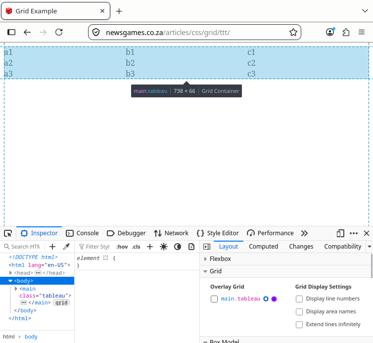
Firefox’s inspector tool helps show what’s going on.
Sizing Cells
The key thing to avoid is horizontal scrolling irrespective of whether the user is seeing a page as portrait on a smartphone or landscape on a laptop, so we need to ensure the overall container gets pushed bigger than the screen width.
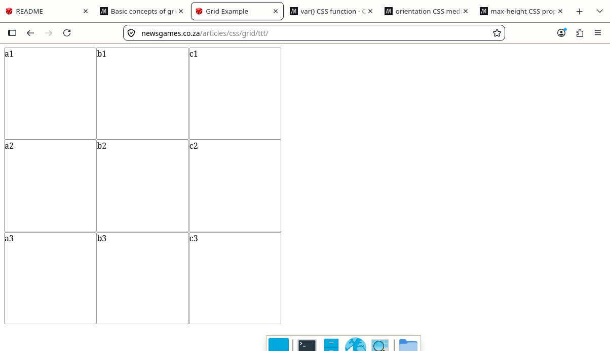
Here the relatively new orientation CSS media feature along with the var help me make the most of whatever screen real estate my site appears on with square cells:
@media (orientation: landscape) {
  :root {
    --side: 30vh;
  }
}

@media (orientation: portrait) {
  :root {
    --side: 30vw;
  }
}

.tableau {
  display: grid;
  grid-template-columns: repeat(3, var(--side));
  grid-auto-rows: var(--side);
}

.tableau > div {
  border: 1px solid #999999;
  border-radius: 3px;
}
Columns or rows?
The above combination of grid-template-columns: track-list to set column widths with grid-auto-rows: height to set row heights is usually what I want.
An exception is Bowling Solitaire where to get the pyramid of pins I wanted to work by rows and leave columns flexible so used grid-template-rows with the cards in each row centred in a shared column.
Since most of my learning projects have involved solitaire card games, has been a natural choice. Starting out, I overcomplicated my stylesheets by including things which I subsequently learnt are best done automatically.
As explained in transposing, if I want to
work by row instead of column, I use
grid-auto-flow: row;.
Centering the container
I’ve personally found the difference between justify-content, justify-items, and justify-self hard to understand.
Through trial and error, I found adding
justify-content: center; to the .tableau {}
stanza did the job of horizontally centering the 3x3 grid.
Horizontal Alignment
Note: auto track sizes (and only auto track sizes) can be stretched by the
align-contentandjustify-contentproperties. Therefore, by default, an auto-sized track will take up any remaining space in the grid container. — MDN
Not having read the above warning, I didn’t know that
grid-template-columns switched off
justify-content.
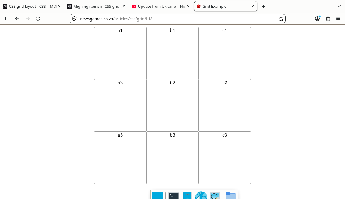
Eventually I figured out text-align did the job. The name is confusing because it doesn’t just align text, but any inline content (buttons, images…) in the cell.
Adding text-align: center; to either
.tableau {} or .tableau > div {} got me
this:
Vertical Alignment
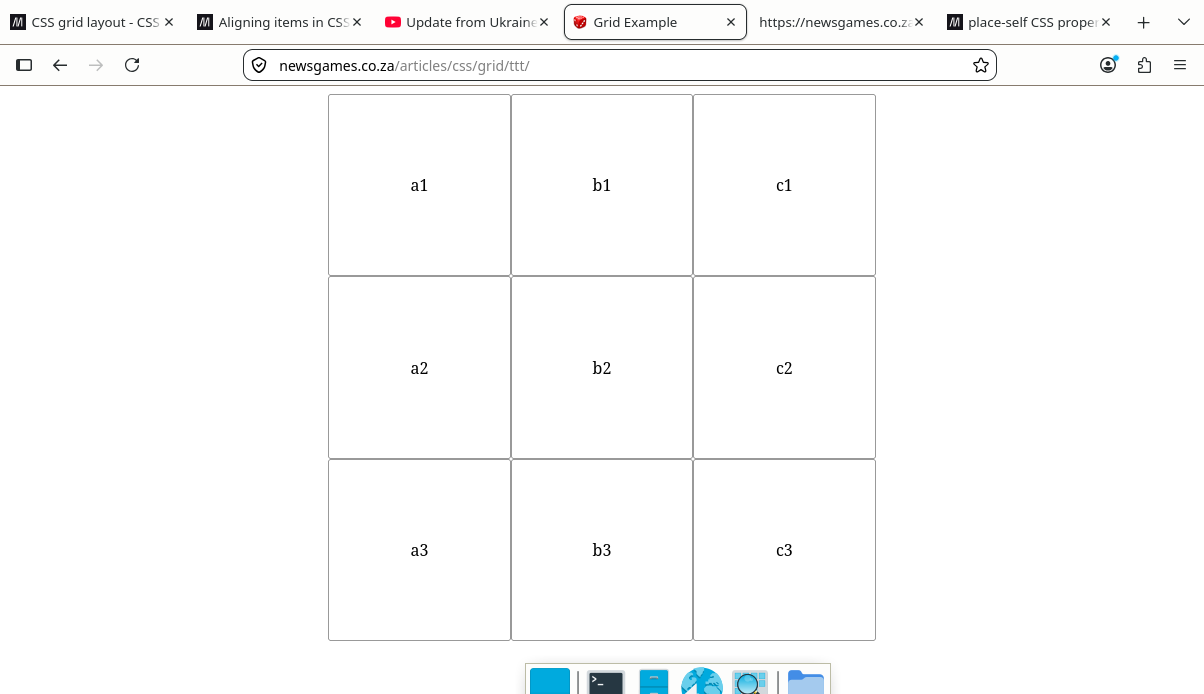
Since we’re using grid-auto-rows, align-content
works here.
If the grid was done with auto aligned columns instead of rows, then
vertical-align
would be used the same way as text-align above.
.tableau {
  display: grid;
  grid-template-columns: repeat(3, var(--side));
  grid-auto-rows: var(--side);
  justify-content: center;
}

.tableau > div {
  border: 1px solid #999999;
  border-radius: 3px;
  text-align: center;
  align-content: center;
}
I thought that moving align-content: center; to its
parent container tableau as
align-items: center; would work the same, but it did
nothing. I have no idea what align-items does in grid
layouts. Possibly it’s just meant for flex.
Mind the gap
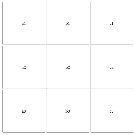
Using the gap property in the container block:
.tableau {
  display: grid;
  grid-template-columns: repeat(3, var(--side));
  grid-auto-rows: var(--side);
  place-content: center;
  gap: 4px;
}
The cells get separated:
Transposing the Matrix
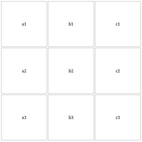
To flip rows into columns, use grid-auto-flow: row;.
.tableau {
  display: grid;
  grid-template-columns: repeat(3, var(--side));
  grid-auto-flow: row;
  place-content: center;
  gap: 4px;
}
Individual Cell Alignment
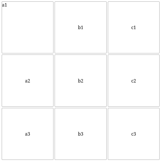
To make only the “a1” text to in the topl left corner, the values set
in .tableau > div {...} get overwritten like so:
#a1 {
  text-align: start;
  align-content: start;
}
I experimented with align-items and
align-self at various levels of the hierarchy, but couldn’t
get them to work.
Unequal Sized Cells
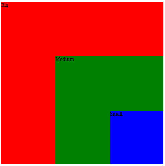
This is based on an example in Mozilla’s Basic concepts of grid layout article.
For games, I prefer not doing this style of layout since I want every grid cell to be a unique drag or drop target for images. I also prefer auto placement since then the order of elements in the HTML file tallies with the grid.
This example shows the cells can be placed on top of each other using grid-column-start and relatives.
@media (orientation: landscape) {
  :root {
    --side: 30vh;
  }
}

@media (orientation: portrait) {
  :root {
    --side: 30vw;
  }
}

.tableau {
  display: grid;
  grid-template-columns: repeat(3, var(--side));
  place-content: center;
  gap: 4px;
}

.tableau > div {
  aspect-ratio: 1 / 1;
}

#big {
  grid-column-start: 1;
  grid-column-end: 4;
  grid-row-start: 1;
  grid-row-end: 4;
  background-color: red;
}

#medium {
  grid-column-start: 2;
  grid-column-end: 4;
  grid-row-start: 2;
  grid-row-end: 4;
  background-color: green;
}

#small {
  grid-column-start: 3;
  grid-column-end: 4;
  grid-row-start: 3;
  grid-row-end: 4;
  background-color: blue;
}
Layered Cells
On my first attempts to use z-index,
I got nowhere until I discovered the default
position: static causes it to be ignored.
This isn’t the case for grid cells. If I edit the above to give the
big block z-index: 1;, it hides the medium and small blocks
which have the default z-index: 0; value. If I change the
medium block to z-index: 1;, it hides the smaller
block.
Automatic Sizing
If a cell has a bigger image placed in it that its size, it expands. Something that tripped me up creating these solitaire card games was I wanted overlapping card images in columns, eg The Bogey vertically or Skyway horizontally. Initially I placed blank images in the div containers, thinking position: relative was what I wanted to move an image within its container. Here I hit the snag that the grid cells size themselves according to the blank images position before it got moved, so I had to use position: absolute which causes the grid layout to pretend the images aren’t there.